Convert™ & Finance Navigator™
A UX-Driven Solution to the Problems Within Automotive Financial Applications
Research & Analysis: Research: Uncovering Frictions in the Online Vehicle Finance Journey
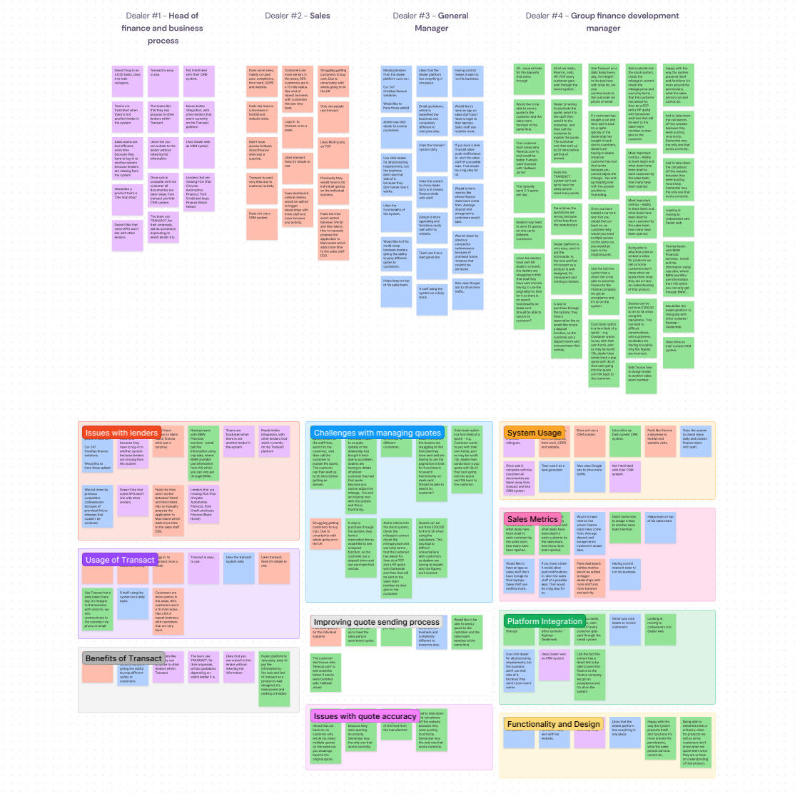
At iVendi we brought together research, sales, data and UX specialists with a single ambition: to set the industry standard for applying for finance on any dealer's site. Our existing Convert widget, which embedded into dealer sites already let users generate finance quotes via lender API's, and also reserve, or even buy outright. Yet once buyers decided to apply for finance the experience quickly lost momentum, offered little reassurance and left many applicants facing unnecessary rejections. We needed a solution that would remove friction and ambiguity, and restore confidence, a product that would later become Finance Navigator.We began by observing real customers as they applied for finance through our existing software. External user‑testing platforms captured click paths, time on task and facial cues, giving us rich evidence of their motives and struggles. Participants consistently cited four pain points: opaque industry terminology, poor visibility of progress through the form, clumsy navigation between sections and no way to review or correct details once they had moved on.To benchmark our findings we analysed the journeys offered by leading lenders and comparison sites. The best competitors signposted application buttons clearly, split their forms into logical chunks and sped up data entry with postcode look‑ups and number‑plate recognition. They still fell short in key areas: users could not track their application online, part‑exchange valuations were handled offline and status transparency was almost non‑existent. Turnaround times were admirable, yet the overall experience lacked clarity and control.Workshops with compliance officers, industry experts and internal stakeholders revealed several optimisation levers. Pre‑populating known data could cut drop‑off dramatically, login gates needed to appear at the start rather than mid‑journey, and asking for bank details only at the final step preserved user engagement. Crucially, we learned that non‑prime applicants could often qualify for prime rates if asked a handful of additional questions, while many prime customers could be pre‑approved after answering only the basics. This insight inspired the concept of an adaptive form flow that flexed to each user’s credit profile.Usage analytics showed that most visitors accessed dealer sites on mobile, but Convert’s application flow had never been fully optimised for small screens. Long input fields, limited feedback and fixed page lengths forced users to pinch, zoom and scroll. The resulting frustration contributed to abandonment rates and, for those who did persevere, a hard credit check that often ended in a refusal. Protecting credit scores and improving mobile usability became immediate priorities.Together these strands of evidence pointed to a clear opportunity: a central hub where customers could apply, track and manage their finance journey in one place. Finance Navigator, embedded within Convert and optimised for mobile, would deliver soft‑search eligibility checks, transparent status updates and jargon‑free guidance, reducing rejections and building trust every step of the way.

Analysis & Approach: Crafting a Tailored Experience We're Confident In
Synthesising our research insights, we identified four strategic priorities. First, we would protect customers’ credit scores by implementing soft‑search eligibility checks up front. This would allow users to discover their likely outcomes across multiple lenders without any hard inquiry, alleviating anxiety and reducing wasted lender resources. We also aimed to reassure the user throughout that their credit would not be affected with Finance Navigator.Second, we committed to demystifying finance language through a layered information strategy. Primary labels would use plain, friendly English, supported by concise, tooltip‑activated explanations. An omnipresent glossary of terms, accessible through a fixed link, would allow users to explore definitions without losing their place in the form.Third, we embraced FCA guidelines and lender focus on pre‑approval as a badge of quality. By highlighting pre‑approved offers early and visually distinguishing them from indicative quotes, we would build user trust and align with the FCA's encouragement of responsible lending. This emphasis on pre‑approval would also serve as a powerful marketing proposition for dealers and lenders.Finally, we re‑imagined our commercial model. Moving away from a fixed‑fee widget licence, we proposed a performance‑driven commission structure, tying our success to completed, approved applications. This realigned incentives across iVendi, dealers and lenders, fostering stronger partnerships and reducing perceived risk for integration.Throughout the planning phase, we translated these strategic pillars into low‑fidelity prototypes and user‑flow diagrams. Technical feasibility reviews ran in parallel, ensuring that our vision could be delivered without major architectural hurdles. We iterated rapidly, testing assumptions about form length, field order and error‑handling with small user cohorts. Each round of feedback drove refinements to layout, phrasing and fallback states.To conclude, while Convert already offered a seamless and dealer-branded way for users to generate quotes, reserve vehicles, and even complete outright purchases, we recognised that the traditional finance application process within it wasn’t serving consumers as effectively as it could. Rather than dismantling what already worked well, we made a conscious decision to preserve Convert’s intuitive user experience and clean integration into dealer websites. However, when it came to starting a finance application, we redirected users to Finance Navigator. This allowed us to guide customers through a credit-friendly, eligibility-first journey that protected their credit scores and provided greater transparency from the outset. By combining the strengths of Convert with the safeguards and clarity of Finance Navigator, we created a journey that kept users engaged while better serving their financial well-being.So, with a finalised, validated prototype in hand, the new Finance Navigator product and Convert's overhaul were ready to be built.
My Solution: A Human-Centred Design Approach
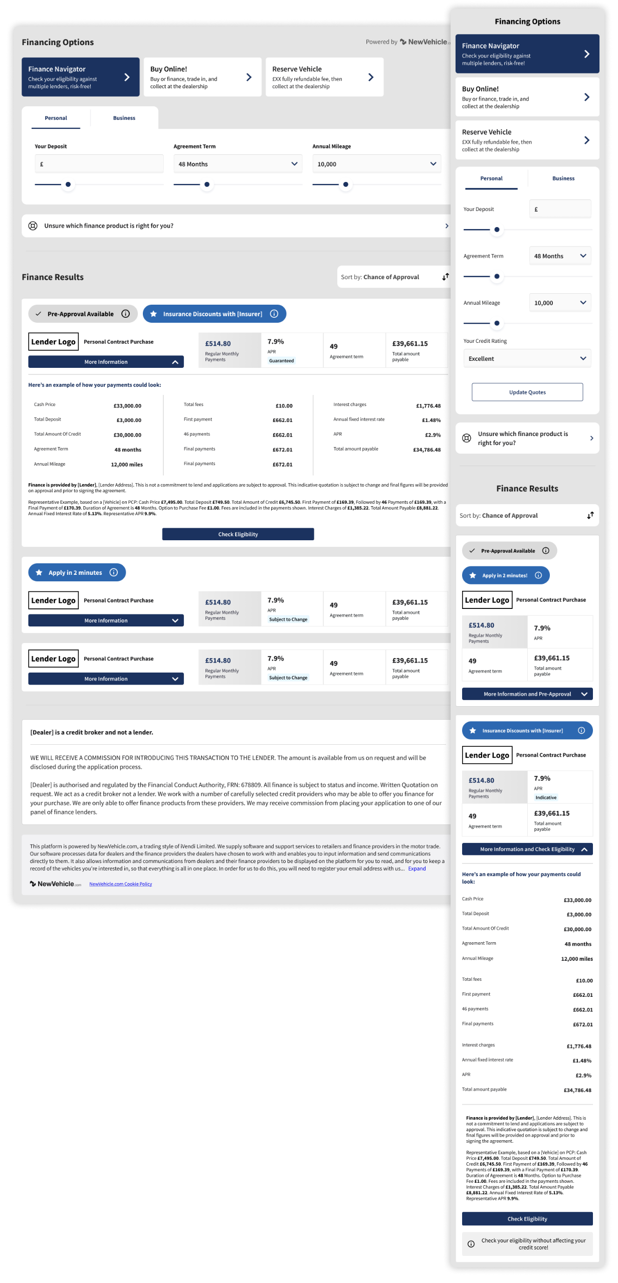
The New & Improved Convert Widget
The Convert widget acted as the foundation for our finance solution and had already proven its value across thousands of dealership websites in the UK and Germany. It was fully customisable to reflect each dealer’s brand, providing users with a visually familiar and trustworthy experience. From this interface, customers could view a vehicle, adjust terms such as deposit amount and agreement length, and instantly see finance quotes tailored to their preferences. It also offered the ability to reserve the vehicle or buy it outright with cash, creating a seamless purchase journey. This flexibility and ease of use were key strengths we were keen to preserve.What was missing, however, was a way for users to gain clarity on their likelihood of approval before committing to a full finance application. The Convert widget previously allowed customers to apply directly for finance after generating a quote, but without any eligibility check. This meant that a large proportion of users were applying without knowing whether they were likely to be accepted, often resulting in rejection and a hard credit search on their file. To address this, we chose to reroute all finance application flows from Convert directly into Finance Navigator. This new flow introduced a user-friendly, credit-safe journey that prioritised pre-approval and gave customers confidence before moving forward.When users now view finance options in Convert and choose to apply, they are taken seamlessly into Finance Navigator. The branding remains consistent, and the vehicle details are pre-filled, maintaining continuity and reducing effort for the user. Finance Navigator then performs a soft credit search behind the scenes, showing customers what lenders are likely to approve them, or if they’ve already been pre-approved. This shift not only improves the customer experience by reducing credit risk and increasing transparency, but also significantly improves the quality of applications received by lenders and dealers, making the entire process more efficient for all parties involved.

Accessing & Completing Finance Navigator
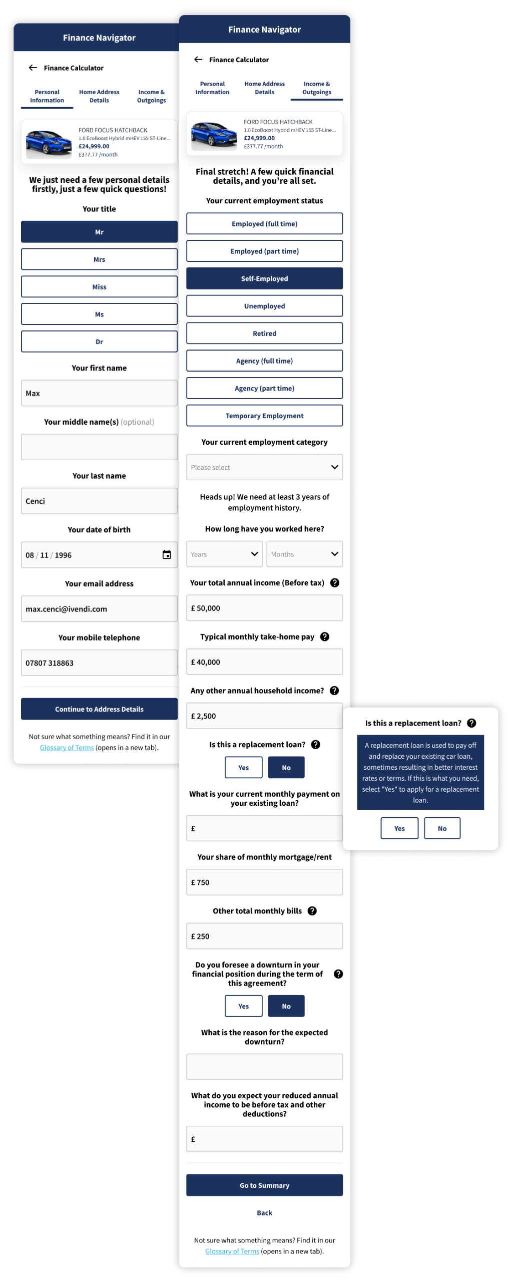
The Finance Navigator form takes centre stage in the renewed journey, guiding customers through a clear, credit‑friendly pathway that feels as straightforward as an everyday checkout. From the moment the form loads, users are welcomed by conversational copy, immediately setting a reassuring tone. Each question is phrased in plain English rather than financial jargon, making it easy for first‑time buyers and seasoned motorists alike to understand exactly what is being asked.To support this language strategy, we embedded an always‑available Glossary link. Clicking it opens concise definitions in a new tab, so users never lose their place in the flow. In addition, unobtrusive tooltip icons sit beside potentially ambiguous fields. Tapping these icons reveals bite‑sized explanations that clarify why the information is needed and how it will be used, cultivating transparency and trust.Navigation is streamlined by a dynamic progress bar that doubles as a roadmap. Users see upfront how many steps remain and can jump back to earlier sections to amend details without triggering validation errors. Behind the scenes, an adaptive logic engine hides unnecessary questions for customers who already meet prime lending criteria, while surfacing extra fields for non‑prime applicants to bolster their approval chances. Address and vehicle lookup APIs further accelerate completion times, auto‑filling data wherever possible and reducing manual entry.This thoughtful blend of friendly language, contextual help and adaptive flow transforms what was once a daunting finance application into a guided, confidence‑building experience. By removing anxiety around hard credit checks and ensuring every interaction is clear and purposeful, Finance Navigator not only improves submission quality for lenders but also empowers consumers to proceed with certainty.

Results - The Final Problem Solution
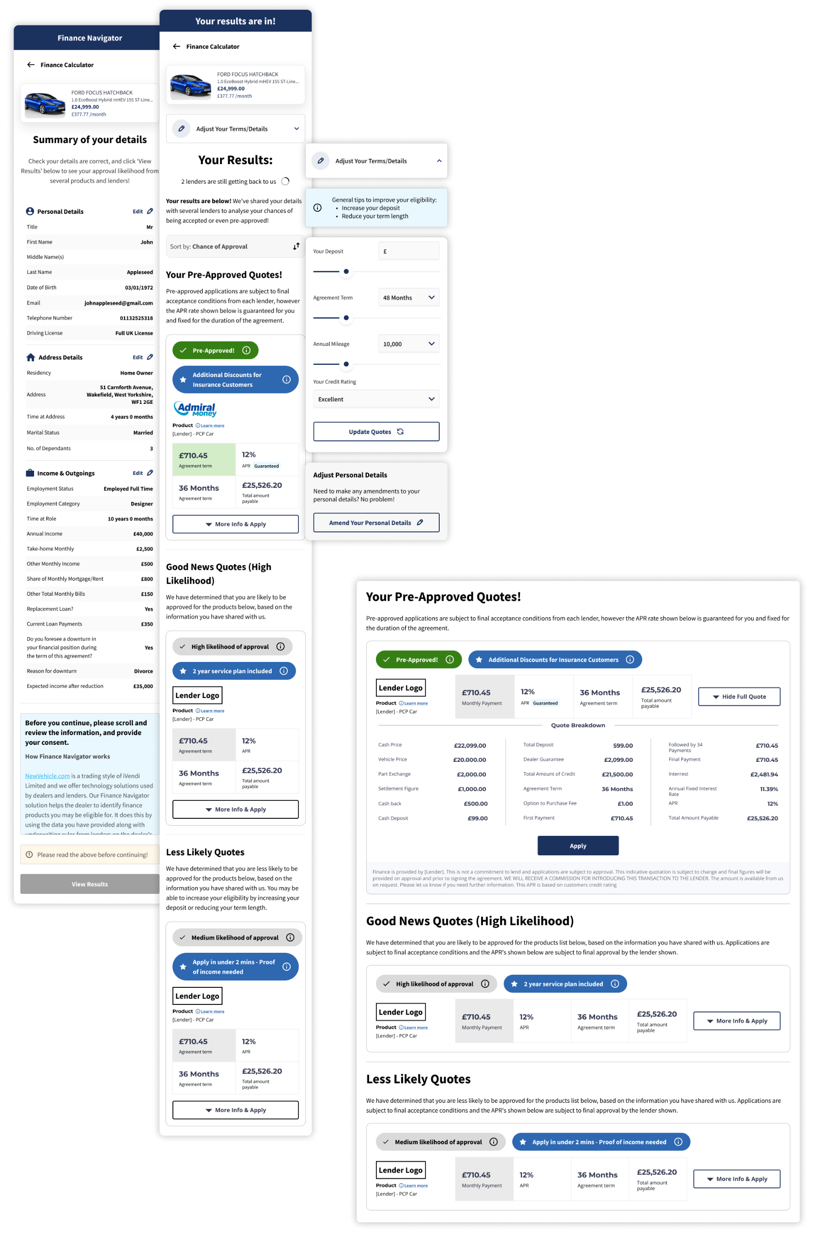
The results screen plays a vital role in achieving one of Finance Navigator’s core goals: reducing the number of rejected finance applications by giving customers full visibility of their likelihood of approval before they commit. Rather than asking users to blindly submit a full application, we surface soft-search results from multiple lenders in a clear, categorised layout that empowers them to make informed choices.Offers are grouped by chance of approval, starting with clearly marked pre-approved results. These sit at the top of the page and are accompanied by reassuring messaging that encourages users to proceed with confidence. Below that, results are separated into likely and possible outcomes, giving users realistic expectations and helping them avoid options that may lead to a rejection. This visibility into their standing with different lenders helps prevent unnecessary damage to their credit scores, while also improving the quality of applications received by lenders and dealers.Each offer is laid out with essential information such as monthly cost, APR, term length, and any associated conditions. Rather than using financial jargon, we present this information with user-friendly labels and tooltips that explain key terms in everyday language. A link to the glossary remains available at all times for further support.To give users even more control, we included simple tools to sort or filter offers by the criteria that matter most to them, whether that's lowest monthly payment, best APR, or highest chance of approval. If a user decides they’d like to improve their results or explore different scenarios, they can easily amend key inputs like deposit amount or agreement term without re-entering all their details. New results are generated instantly, offering a smooth, flexible way to explore their options.By showing real eligibility outcomes upfront and offering a supportive, transparent experience, the results screen significantly reduces the chances of customers applying for products they’re unlikely to qualify for. This not only improves consumer outcomes but also protects lender resources and builds long-term trust across the entire finance journey.

To conclude:
This project set out to solve some of the most persistent and damaging problems in the online vehicle finance space, and we surely delivered! By combining our trusted Convert widget with a newly developed, user-centred Finance Navigator, we created a full journey that not only supported customers through their decision-making, but actively protected their financial wellbeing.We tackled the issue of high rejection rates by introducing soft-search eligibility checks, giving users full visibility of their chances before they applied. This alone helped reduce unnecessary hard credit searches and the stress they cause, while improving application quality for lenders. We addressed widespread confusion around financial terminology by rewriting every label and field in human language, supported by a glossary and intuitive tooltips. We solved navigation issues with a clear progress indicator, a responsive layout optimised for mobile, and the ability to amend details at any stage of the journey.We also made smart use of what we learnt about user intent and credit risk. Our adaptive form logic asked more questions only when they were truly necessary, helping non-prime customers improve their approval chances while making the experience faster and lighter for prime applicants. And by redirecting all application journeys from Convert to Finance Navigator, we ensured that every customer would benefit from this guided, credit-safe process without losing the familiarity and ease of our original tool.This wasn’t just a design improvement, it was a complete rethinking of how digital vehicle finance should work, with users’ needs at its core. In the weeks following launch, we were extremely proud of our results: £200,000+ in monthly revenue, a 93% reduction in rejected applications, and steady month-on-month growth as more lenders and dealers joined the platform. We turned deep research into action, solved genuine industry challenges, and delivered a solution that works better for everyone involved.
Let's connect on LinkedIn.